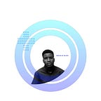
Grid system
Sometimes over griding stuff will lead to over rigid result — Using grid system appropriately will help to achieve a well organized design
I do look out for these grid base layout
1. Alignment
2. Visibility
3. Gap or spacing between this contents( Grid gap) - space btw the columns and btw the rows
The best grid layout is one which provides no distraction from the content
NB: The Grid “system” is only good if it is easy to follow and repeat.
Layout and composition
The key to mastering layout and composition is to pay attention to little things
1.Negative space(white space) - separate section of your design.. Also allow breathing, Allow and also fill out the negative space by - scaling , legibility, visually good to read
I Pay attention to negative space in design
2. Proximity - Elements having relationship should be grouped together
3. Repetition - help more in the look and feel of element, colour scheme throughout all the design , similar shapes and design, typefaces
4. Contrast- color, shape, typeface, elements, size. Help to create a focal point. Also balance. Also give visual weight and balance….Guide viewers eye
5. Alignment
6. Focal point - start the view of users journey(What dominate)
7. Hierarchy
Color
Warm colors are said to appear more active, while cool colors tend to recede or fade into the background (Color Theory).
Following color psychology helps you better
Color Psychology
Color psychology refers to the emotional conditioning of color — its impact on how people think, feel, and act.
Blue — Trust, Intelligence
Red — Love, Energy, Passion, Anger, Hunger
Black — Bold, Rich, Power, Evil
Green — Soothing, Natural, Jealousy, Balance, Restful
Yellow — Cheer, Childish, Warmth, Optimistic
Orange — Youthful, Happy, Attraction, Friendly
Pink — Sensitive, Caring, Love, Sexuality, Emotion
Purple — Royal, Luxury, Mysterious, Sadness